Tips & Tricks

HOME | PART ONE | PART TWO

Photoshop is a powerful tool. So are many of the free alternatives! I believe a lot of them can do most of the stuff I’m going to mention here, so just have a look around to see the if there are some similar options.

Layer styles are a fun way to add things to your images. This can be more lens flares, spell effects or anything sparkly! I have a huge folder I’ve accumulated over the years that contains ‘spell effect’ like images. Seriously it’s like 2 gigs.
A good place to find these sort of images is Deviantart.com, and browse ‘resources & stock images” “textures“. Let’s find a few good examples. I’m going to search ‘flare‘ first.

Here is a nice one! If you are going to download any of these, I highly recommend setting up a new folder dedicated to just holding these sort of effect images. It’s a rabbit hole. You’ll be glad to have them all in one place when you want to use them later.

If you find one you really like, you can also ‘browse more like this‘. Here is what I get with that.

If you like something someone has made, check out their gallery because chances are they have a lot more!

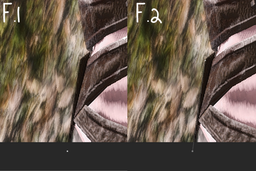
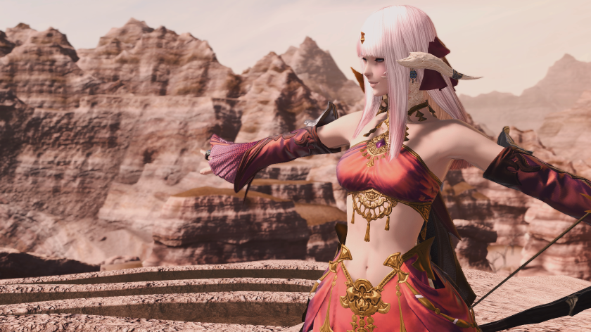
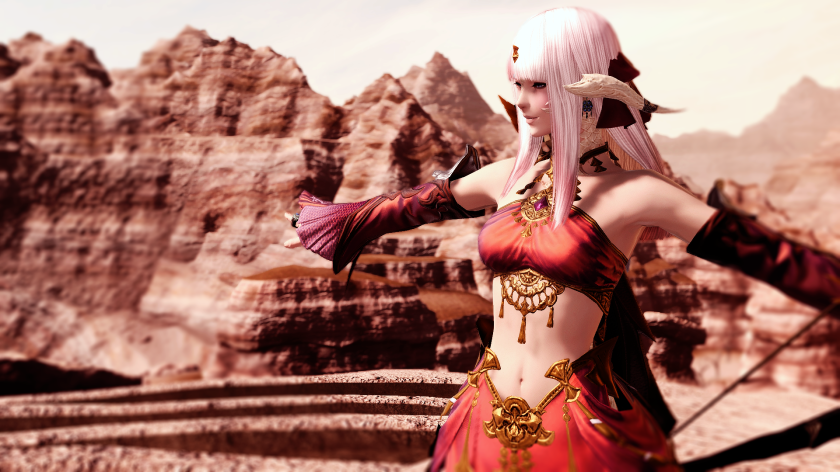
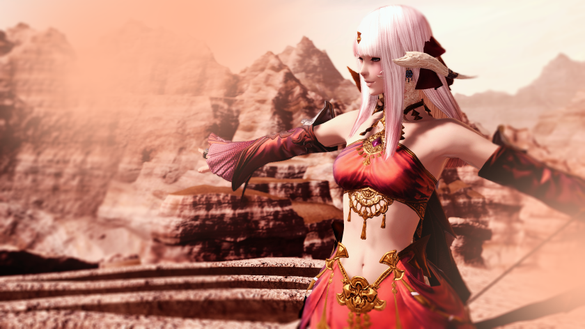
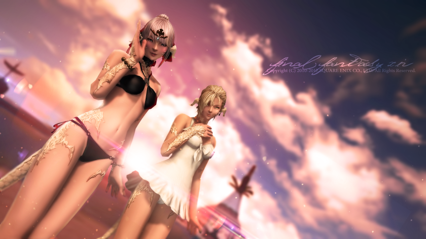
For the below screenshot, I combined all of our previous tutorials. You can see here the reason cutting your character out is helpful. I completely changed the background image colors, but only slightly adjusted the characters. Had I just toned the whole image, they’d be really pink and weird looking.

beachbeforebeforespelleffects

But I want to enhance the sunspot behind them with some more flashy flares. So I’m going to use similar images to the ones that I linked above, but I’m going to pull them from my own folder and unfortunately I don’t remember where a lot of them came from.

beachwithlayer

So I have this nice redish flare. I’m going to first open it in Photoshop and along the top menuSelect‘, > All. Then I’m going to copy, either by CTRL+C or Edit along the top menu and > Copy. Then I’m going to close the image I just opened, as we probably won’t need it again (and having excessive windows open can choke photoshop).

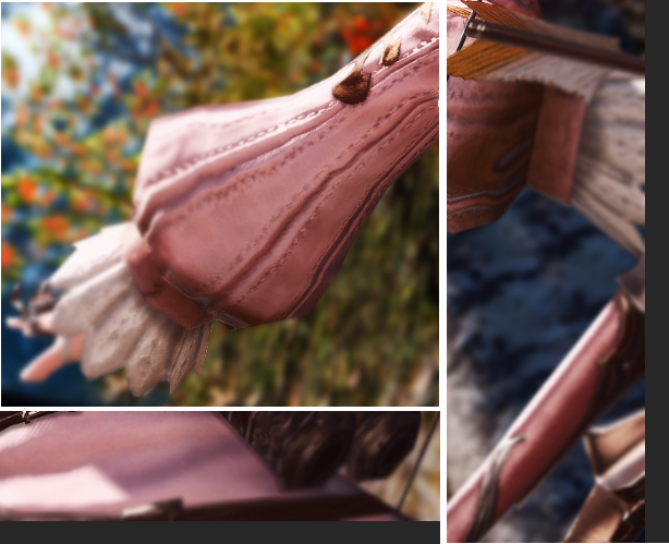
Then going back to my screenshot, I’m going to CTRL+V or top menu Edit>Paste. As you can see, most of these effect images have a black background. That’s because when we apply a layer style to it, that black will go away! Sometimes it leaves a soft edge which I erase with a large soft eraser tool.

I also wanted it more pink, so I went to top menu Image > Adjustments > Hue/Saturation and I pulled the top slider until it was the color shown above.

So go to your Layer Style and set it to ‘Screen‘ or ‘Liner Dodge (Add)‘ (or whatever you want!).

layerstyle

You’ll see the black disappear! Most of these look best at 100% opacity.

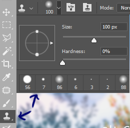
But you’re going to want to move the flare around to position it, so with the layer still selected, go to Top Menu Edit > Free Transform or press CTRL + T.

ftt

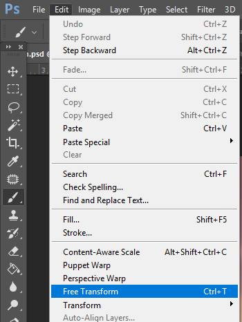
You’ll see a bounding box around the layer now. Hovering outside of the box will change your cursor to curved arrows, click + drag to rotate around. If you need to resize, it’s best to grab the little squares located at any corner and hold shift while click + dragging. Holding shift tells Photoshop to maintain aspect ratio. Once you are happy, press CTRL + Enter to apply the transformation.

boundingbox

If the image you’re using is really large, the bounding box will appear outside the canvas. Hold ALT and Scroll your mouse wheel to zoom out enough to reach the edges.

screenlayer

Now I want to add some more. Same thing. This time I’m going to use the same image twice, just mirrored.

flares1

So first I would Duplicate (Right click on layer, Duplicate) the layer I pasted. Now to mirror a SINGLE layer only, you’ll want to have that layer selected and then Top Menu Edit > Transform > Flip Horizontal. 

fh

Then, I’m going to set both of those layers to ‘Liner Dodge (Add)‘ layer styles and use my soft eraser to remove and edges I see.

beachafter

The last thing I did was with some brushes. This is the speckled areas. Again, Deviantart is a great place that artist share their creations for you to use on! There is an entire section dedicated to Photoshop Brushes.  Again, it’s another rabbit hole…

So I just want some simple speckly brushes. Once again, I’m using a brush I’ve had for a long time and I am not sure where exactly I got it. But, it’s a simple brush there should be lots of – search for ‘dust’ , ‘speckle’, ‘bokeh’, ‘snow’, ‘rain’, to get similar brushes.

Here I create a new layer again and with a soft yellow orange such as in the sky, I just click around with my brush until I like it. Then I set the layer to ‘Overlay‘, at 100% opacity.

I imagine that’s sea foam or something, who knows!

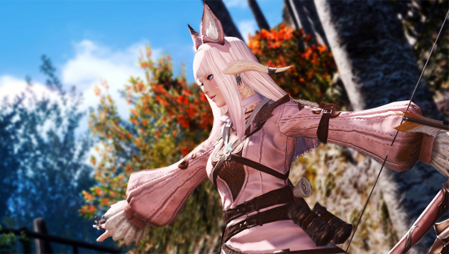
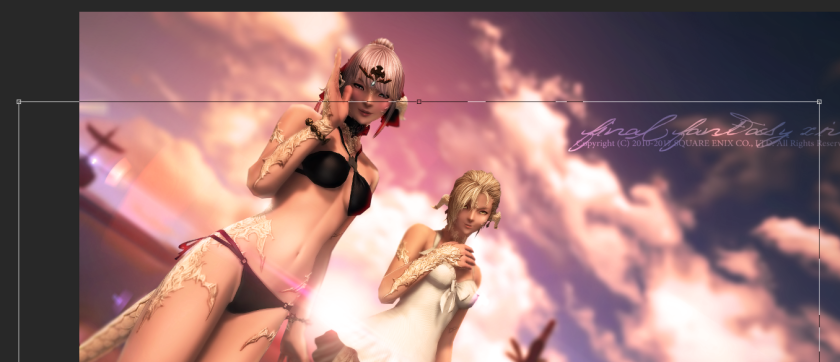
Let’s do it again, this time something a little different. I’m going to use the same ideas with the layer styles, but I’m going to add some fancy stuff around my character. This is just a random shot I pulled out of my folder, so it’s not the best subject for this type of edit. I think it works much nicer on casters, especially healers. It’s something I use in a lot of World of Warcraft edits!

before1

I only used methods from the Part 1 tutorial, no cutting out of the character to edit here.

I added a flare, and then the fancy bits dancing around my bard. Again, this works better on casters. The best layer styles tend to be Screen, Overlay, and Color Dodge for bright effects.

The best thing to search for these sort of effects are ‘fractals’. They tend to come in huge packs with lots of smaller images. This guy here has huge packs for download!

Remember, the color doesn’t matter much if you like the shape. Just Top Menu Bar Image > Adjustments > Hue/Saturation, Color Balance, or Selective Color to adjust it.

after1

HOME | PART ONE | PART TWO


FFXIV Screenshot Editing Tutorial (+other games). Part 2

HOME | PART ONE | PART 3/EXTRAS

Welcome to part two!

If you wanted to go further with your editing, this is where things will take more time and practice. We’re going to make heavy use of the Pen Tool here, in order to separate our character from the background.

For this, I’m going to be editing this image. Once again, feel free to open it yourself and follow along.

(Once again, this was taken with Reshade on.)

ffxiv_08272017_025055

Lets open the image in Photoshop. The first thing I also do after that is, on the right-hand side in your ‘Layers‘ panel, right click on the image and Duplicate Layer.

dup

This is so you always have the original handy if we need it later.

Select the newly duplicated layer, and this is what we’ll be starting on. (hint: I use too many layers)

Next, I’m going to start by separating my character from the background. This will allow me to easily apply adjustments to the background, or to my character, without influencing them both. This is done with the Pen Tool, which you can select on the left hand side tool menu. The default settings should be correct for what we are going to do.

pentool

The Pen Tool

Now, you’ll want to zoom in to about 300% to use this tool. This is an excellent tool for this because our characters are really pixilated at the edges, which tends to mean we just need straight segments and not much curving.

To use the pen tool, first pick where you want to start. I typically start on the bottom, working up and around. I place the first point outside of the canvas as in F.1, from there you just continue to trace. F.2 shows the next point I clicked to.

f1f2

Typically, FFXIV characters have hard, straight edges, even if they appear to curve at a distance. As you can see in F.3, this is going up the side of the body. These are just straight clicks, each dot representing a new click. The color changed because I wanted to make it easier for you to see.

f3

In F.4,5, & 6 as we approach the hair, this shows how you can tackle big curves. First make a straight anchor with the pen tool then click in the middle of it to add an anchor point. Next, hold CTRL and click on that little square that you made on the line and drag it. You can drag in, out, down or up at the same time to change the way the curve happens. This is how you can make micro adjustments to your pen paths.

456

A few more notes on using the pen tool. You want to start by outlining your toon. This means trace the areas on the outside first, ignoring any areas where you could have to cut into any part of your toon. Ignore those; we’ll get to them layer. If you need to take the pen path outside of the canvas, that works just fine.You want to keep going until you come back to your original starting point.

The red lines below show where the pen tool should be used first.

outline

Then you want to right click along the line, and hit ‘make selection’. This should turn your path into ant lines.

Next, pick the selection tool

selection

then right click inside your ant lines and select ‘layer via copy’. After that, create a layer* under the one that was just created and color-fill it with the paint bucket tool.

Now you can see which areas need cutting out. For that, just repeat the pen tool process, but instead of ‘layer via copy’, just cut it away (delete key).

*to create a new layer, click the little page button at the bottom of your layers panel

addlayer

Here we are with everything cut out.

cutout

The Background

Now let’s start messing with the background first. On the layer that you color filled, click the little eyeball next to it to hide it.

hide

Select the background layer, and go to the menu along the top of your screen ‘filter’. Select blur>Gaussian blur.

filter

Play around with the number until you like the look, make sure ‘preview’ is selected. This will create a haze around your character, which I’m not fond of, so I will also show you how I remove this.

gt

To sharpen the appearance of our character against the background, we’re going to use the Clone Stamp Tool. This tool will allow you to duplicate areas into other areas. With the Clone Stamp Tool selected, adjust the brush properties in the top left.

I use a default brush, set to size 100 with 0% hardness. Opacity & flow at 100%. To use this tool, you hold alt and click on the area that you want to copy. Then you move the brush to the area you want to change. Paint with the brush until the haze disappears, taking copy points from around your toon. Your brush will show a small preview of what it is taking information from. Adjust brush size and alt points as needed.

cst

Now that we’ve done all the work cutting out our toon, we can edit the background anyway we want without worrying. I’m going to drastically enhance the colors, but you could go so far as to completely changing them. In case you don’t like what you’ve done, I suggest duplicating the background layer again – the one you blurred & clone stamped!

1st

Getting the first result is simple. I did Auto Tone, which is located under ‘Image’ on your top menu bar.

autotone1

Then, I went to image > adjustments > brightness/contrast and played there until I liked it. A lot of times I up the contrast a whole lot.

Now, you can either do it this way…

cbmenu

Or this way.

mask

We can click the little half-filled circle icon at the bottom of the layers panel to apply mask that can easily be turned on and off. This is a good option to use if you are batch editing screenshots that are all similar in lighting and color, because you can then just drag these over to another photoshop file!

I further enhanced  by going to image > adjustments, color balance. These sliders will tone the overall image. Change ‘midtones’ ‘shadows’ and ‘highlights’, too.

2nd

I further popped individual tones like red and yellow by going to image >adjustments > selective color.

3rd

Lastly, I pulled the sliders around in image > adjustments > levels until I was pleased with the coloring.

The Character

Lets do some basic work on the character now. Same steps as before. First, duplicate your character cut-out and the click the little eyeball beside the old one so that it is now hidden.

hide

That’s your go-back to point if you mess up a lot and want to start over. With the duplicated layer selected, go to image > adjustments. What I did here was brightness / contrast, color balance + selective color until I was pleased with it.

cw

Remember how we can use layer mask instead of directly changing the image? You could do that here, too. But it will affect the background too unless you tell Photoshop that you only want it to effect your character layer. So, when you create a new mask,

mask

you’ll then want to right click on the layer it created and select ‘create clipping mask‘. Make sure the layer is directly above what you want to attach to. From there, anything you attach to the parent or children layers will only effect the parent layer.

ccm

Now lets apply some simple shadowing to the face & other areas. For this we’re going to use the pen tool again. Trace the face out against the hair like F.2.

pts

When done, right click and ‘make selection’. Then, create a new layer above your character (the paper sheet in the bottom right). Select a dark color (I used dark brown). Color-fill the selection. Set the ‘Layer Style’ to Multiply, by changing the drop-down menu at the top of your layer panel from ‘Normal’. Then, drop the ‘opacity’ down to about 20-30%.

layerstyle

After that, we’re going to erase most. Click the Eraser tool,

erase

and for the brush properties, use a default round brush set to about 35px with 0% hardness, and opacity at around 30%. Starting from the middle area, erase most besides along the edges of the hair/jaw. I like shadowing pretty subtle, so I mainly like it along the hairlines. Remember to release the mouse frequently to erase more color; doing it this way softens the effect greatly. Repeat steps anywhere else you want shadowing!

shadowbefore

For body shadowing along equipment, we’re going to use the pen tool again, but in a different way. Create a new layer right above your toon layer. Right click that layer, and select ‘Create Clipping Mask’. This means when we make marks on this layer, the effects won’t hit the background at all. It’s locked to the character layer. If you’ve used this method earlier, the layer you create may already be parented so you’re good to go (It will say ‘release’ clipping mask if so.)

Go along the edge you want a shadow with the pen tool, and it’s best to be slightly away from the object casting the shadow instead of right along it. We’re just going to keep it a line this time.

penpath

Once done, click on your Brush tool,

brushlocal

and set the brush properties to something like default round, 7px, 0% hardness, 80% opacity. Go back to the pen tool and right-click near your path. Hit ‘stroke’ and make sure it’s set to ‘brush’ . Apply it. Now right click again, and ‘delete path’. Now set your layer to Multiply and drop the opacity until it looks nice. Use a soft eraser tool at low opacity to soften blunt edges. Repeat steps along anything you want a shadow. Combine what we did on the face to larger areas.

shadowafter

Finishing Touches

We’re nearing the end for this round! There are some last small details to add to my image. Yours may not need some of the things I’m doing here, but I’ll show you how anyway!

clipping

I wanted to fix the clipping on the bow string. So, I used the pen tool to trace out where it should be and right click > make selection. Then select the Clone Stamp Tool we used earlier. ALT+Click along a section of the bow string and the paint into your section until it matches.

cstt

Here I wanted to set the character into the scene more, so I selectively blurred some areas. Mainly the far hand, the far ear, and the front bottom half/bow. I did this with the Blur Tool,

blur

Blur on the character layer.

blurrrr

Next I wanted to add some shine. I created a new layer above the character layer and ‘Create Clipping Mask’. With a large round brush, between 500-1100px at 0% hardness and 70% opacity I dabbed around the far half, avoiding the face too much.

screen

Then I set that layer style to ‘screen’. I did the same thing to the background layer.

layerstyle

It’s pretty standard that you add back in the watermark FFXIV puts on your screenshots by default. Here I used two different fonts at two different sizes with the Type Tool and lowered the opacity of the layer, placing it somewhere pleasing to the eye. You can download + install many, many, too many fonts from different sites to use in Photoshop. One of my favorite places is 1001fonts. Just install them and Photoshop will automatically detect them, no need to restart.

typetool

Here is what the original watermark says:

Copyright (C) 2010-2017 SQUARE ENIX CO., LTD. All Rights Reserved. FINAL FANTASY XIV

Feel free to rearrange it to your liking.

You can set the Type layers to ‘Overlay’ or ‘screen’ or anything you want, just like our previous brush dabs. This can add more interesting looks to them.

ffx

We’re done!

cutoutbeforecutoutafter

HOME | PART ONE | PART 3/EXTRAS

FFXIV Screenshot Editing Tutorial (+other games). Part 1

HOME | PART TWO | PART 3/EXTRAS

I’ve made a rather large image tutorial and decided that I wanted to add more elements and be able to edit it. There is much I didn’t include simply because it was getting so long; this way, I can just add stuff when I think of it! Awesome!


We’re going to start with the basics. Firstly, I recommend you install Reshade. I can’t stress enough how much it can change your game, and how much more pleasing to the eye it is. I can’t play without it anymore!

Reshade

What is Reshade? Well, I don’t know the technicalities of how it works but it is a 3rd party program that actively changes the way your game looks. You can adjust sliders very similar to Photoshop effects such as color balance, brightness/contrast, and there is a very nice Depth of Field option. There are things like adaptive fog, shadowing, bloom & lens flares…. you can even set up a green screen for your character! While the last thing tends to crash my FFXIV, it doesn’t crash others, you just have to try it.

You can get Reshade from Reshade.me. There are many installation tutorials so I will not cover that part, but this guide was most helpful to me. Other than that, I will say that I had problems getting this to run properly until I went to C:\Program Files (x86), right clicked on SquareEnix and went to Properties, Security, and gave the entire folder Modify permissions. I also installed Reshade as an administrator, and run FFXIV as administrator.

If you already have Reshade or have it now and would like the preset I typically use, you can get it here! Just copy the paste data into Notepad. Save it as whatevernameyouwant.ini, and make sure to set it to ‘all file types’. Then move the file to C:\Program Files (x86)\SquareEnix\FINAL FANTASY XIV – A Realm Reborn\game

*This is for the Windows version, Steam will have a different Game folder you need to find.

Press F8 to turn DoF on/off. Go into the settings and play around if you’d like stronger DoF or to turn off bloom, etc! My DoF is pretty slight, you may want to punch it up a lot more.

In 2013, FFXIV responded that Reshade is allowed however it is ‘at your own risk‘. This means that if it were to somehow break your game, you would be on your own fixing it. You can see the official post here.

Heres a before / after of the original in-game look vs. my reshade preset. The very last screenshot is not  using my preset, rather just playing around with things like adaptive fog and intense colors. However, it looks very much like I plopped that into Photoshop, doesn’t it? Reshade is insanely powerful! Using it makes it so that you can get great base screenshots that don’t need a whole lot of post-processing, and I love the sharpening effect it has – but you can still get away with not using it, too.

ffxiv_08292017_211520ffxiv_08292017_211530ffxiv_dx11 2017-08-29 21-16-04ffxiv_dx11 2017-08-29 21-15-57

ffxiv_dx11 2017-08-15 18-55-29ffxiv_dx11 2017-08-15 18-55-40

The Screenshot

Start by taking a nice screenshot in-game! This can’t be stressed enough. Your lighting, composition, focus and subject are all things that can only be adjusted slightly afterwards so it’s best to start with a good image. Basically, you want to apply real-life photography rules here!

Familiarize yourself with all of the functions of /gpose, as they are very important. There are lots of useful camera tilt functions, different zoom options, lighting effects (hint: where ever your camera is at is where your light will be. so if you zoom your camera way out and place a light source, only a tiny bit of ‘fill light’ will hit where you need it on your character).

Some basic ideas to keep in mind are the rule of thirds; imagine a 6-box grid over your screen. Your subject of focus may look more aesthetically pleasing resting along one of the lines, not directly in the center.

You’ll typically want your subject to be well-lit, although there are plenty of ideas where the opposite is true! However, for lighting; soft is better. Blowing out the highlight areas can be hard to fix, so move into some shade or turn away from the sun. Remember that gpose has lighting effects, too. I find them really useful if you’re in a sunny area that is casting a hard shadow on your face, just like a fill light in real life would do. Just try to watch for harsh shadows & sunlight and adjust your pose accordingly. The lighting in-game changes by the hour, and weather, just like in real-life.

The horizon line behind your character may also benefit from the rule of thirds, in that it should be under or over the center, but not directly center. You can also play with the tilt camera function in gpose, to get some interesting angles!

Again, these are just guidelines for what has long been deemed ‘aesthetically pleasing’ to the eye, that you can apply to your screenshots but are in no-way set in stone. Sometimes, breaking the ‘rules’ make for a better image.

Lastly, take lots of shots! Change the angles just slightly. Wait for the lighting to change (it changes fast). You can always delete what you don’t use.

Basic Editing

I use Photoshop and thus all of my terminology will be based here. There are other programs such as GIMP that are free and have similar capabilities, in some cases identical to that of Photoshop. But, you’ll need to translate my Photoshop talk into other programs!

Let’s start with some really basic editing. This will include the fastest editing options, without cutting your character out of the background (see part 2 for that). This is great when you have a nice screenshot already, that you’d just like to enhance a bit, without going crazy.

So go over your screenshots until you find one you like the composition of and open it in Photoshop.

Here is what I’m going to use. Feel free to try editing it along with me!

original

I always start by Duplicating the ‘background‘ image in the ‘Layers‘ tab, so that I always have the original handy if I need it. You can do this by right-clicking the original layer and selecting ‘Duplicate Layer‘. Then make sure you have your newly duplicated layer selected to work on.

dup

After that, I like to see what ‘Auto Tone’ looks like. It doesn’t always work out, but sometimes it does. Click ‘Image‘ located along the very top menu, and click ‘Auto Tone‘ In this case, I like it, so I’m going to work with it.

autotone1

autotone

Next, I’m going to tone the image a bit to my liking. You can do this by going to Image > Adjustments and directly changing the image,

cbmenu

or we can click the little half-filled circle icon at the bottom of the layers panel to apply mask that can easily be turned on and off. This is a good option to use if you are batch editing screenshots that are all similar in lighting and color, because you can then just drag these over to another photoshop file!

mask

Here, I did Brightness/Contrast, Color Balance, and Selective Color. Here is what I did on each one:

brightnesscb1cb2cb3sc1sc2sc3

And we end up here.

coloradjust

Now I want to apply some blur, and I’m going to use Iris Blur for this. So with the background layer selected, go the the menu up top ‘Filter‘ > Blur Gallery > Iris Blur. This will bring up a tool that lets you adjust the power, size and radius of the blur. This blur is shaped like an oval and it’s the one I use most for this, but you can play around with tilt shift and the others, as well!

blurtool

Just play around with it until you’re happy with how it looks. You can make some minor adjustments afterwards with the blur tool, located on your left panel menu. Typically, for the brush properties, a large round at 0% hardness and about 70% Strength is what I use.

blur

Now here is where we are. Let’s go and add some layer effects to give the image some pop in areas!

blurr1

I’m going to start by creating a new layer above our earlier color adjustment layers. Do this by clicking the little paper icon at the bottom of your layer panel, on the far right.

addlayer

Then I’m going to select a rather large soft brush. It’s a default brush at 1100px, 0% hardness.

brushlocal

brushprop

For the color, I’m gonna go with a light peachy orange, specifically #ffb998. Then, on our new layer, I’m gonna dab around the background – you want to off-center your brush. The center will be the most powerful, but what we really want is the gentle faded edge parts. Here is where my dabs went.

brush

Then, I’m gonna set that layer style to Overlay and the Opacity to about 65%. This creates a lovely glow. Play with the other layer styles; and other colors!

layerstyle

Next, I’m going to create another layer, drop my brush size down to about 30px and keep the other settings. I’m going to dot along some of the gold bits on the outfit, to create more intensity in the shine. I’m going to set that layer to Overlay at 100% opacity.

overlay

We’re nearing the end! It’s standard that you add back in the FFXIV Watermark that is put on screenshots by default, which Reshade sometimes takes away. So I’m going to use the text tool to make a new watermark, located on your left hand menu.

typetool

This is something that can add to the overall ‘wallpaper’ look of your image, it doesn’t have to be boring! Get yourself loads of new fonts to try out, rather than the default options. One of my favorite places is 1001fonts. Just install them and Photoshop will automatically detect them, no need to restart.

I’m going to use this font.

Here is what the original watermark says:

Copyright (C) 2010-2017 SQUARE ENIX CO., LTD. All Rights Reserved. FINAL FANTASY XIV

Feel free to rearrange it to your liking.

You can set the Type layers to Overlay or screen or anything you want, just like our previous brush dabs. This can add more interesting looks to them.

And here is the final results!

originaldone


HOME | PART TWO | PART 3/EXTRAS